drafting
During this stage in pre-production, we will be proceeding with the drafting section using drawing and Photoshop skills. This will begin with the hand-drawn mock-ups, which will then be developed through Photoshop. The following images have been used for inspiration, whilst informing us on the progress required to maintain a clean and professional outcome.
These examples have been used as inspiration for our movie posters due to particular features that were quite eye-catching, such as the low key lighting, layout, and the use of antagonist, etc. Therefore, we will be extracting certain aspects and applying them into our mock-ups.
|
|
Existing Horror Posters
|
|

|

|
|
We liked how on this poster the antagonists eyes were covered because its mysterious and connotes danger. We also like how a red hue has been used which make sit look like it has a bloody glow. Low key lighting has been used and the antagonists face is shadowed and brightly lit in small sections to enhance his features. The antagonist has been featured on this poster rather than the victim/protagonist and we liked this because we feel it is more effective in creating that scary and horror film that a horror poster needs. This is very common, most horror posters you find feature the antagonist. Even though the text in this poster is red we feel that the red dominates the poster too much and would perhaps change the colour to white for our own poster to break the colour up a bit but still look like a horror poster.

We liked the camera angle on this poster and how a high camera angle has been used to give the antagonist a sense of power and made him look superior and dangerous. Because a long shot has been used the setting of the film has also been established. The lighting in particular makes the character look frightening. We can see due to the background that it has been set at night time. His face is lit up due to the bright lighting of the moon behind him. His eyes are dark and shadowed. A prop has been used to make him look intimidating- He holds a huge knife which appears to be dirty in left hand. We might use this idea and add a knife to one of our drafts for that extra scare factor. The prop used also communicates that the film is a slasher film because weapons such as knives are typically associated with this sub-genre.
|
From this poster we thought of adding a mask to our own poster or maybe making our antagonist smile. We think this will look good as it will make the antagonist look sinister like this poster. Again like the poster above the poster has features the antagonist rather than the protagonist. We also like the comic effect given to the mask as we feel that it makes the poster more intriguing and causes the audience to contemplate about the connotations associated with the image. We also like the idea of the main subject's real eyes being visible through the mask as it gives the image layers and makes it more interesting to look at. It is rather conventional for movie posters to have typography such as "FROM THE PRODUCERS OF PARANORMAL ACTIVITY AND SINISTER" and we feel that this gives the audience something to familiarise with.

From the poster we all liked the shadowing technique and the way the light contours his eyes and nose. We also liked the way half of his face is faded. This makes him look mysterious and dangerous and gives the poster an ominous effect. We also liked the colour scheme because it is simple but gives the poster a sense of continuity. We also liked the style of the font because its engaging as the lighting differs from dark to light e.g. the C is the brightest letter which emphasises the word 'Chainsaw' which is a key aspect of the film. We also like the fact that the victims are lighted up in a corner with the similarly lighted figure looking down on them. The fact that they are so small suggests that they are the antagonist's prey and has them cornered and is most probably going to kill them.
|

The main thing that we liked about this horror poster is the use of textures, giving the poster a chilling effect. We also like how the use of the colour blue is faded to give the poster a perception of ice. The use of an extreme close up is very effective as it is eye-catching and grabs the audience's attention as it causes them to want to look further into the poster. We also like how the colour of blue is faded into the eye, giving it the effect of frozen eyes. This is further emphasized by the frozen eyeballs with the hand-print. This gives the poster a horror element and would attract horror fans. We also like the font of the poster as it has a blurred effect further enforcing the genre of the movie.
|

The main image was the most attractive aspect of the poster as it has a chilling effect and makes the poster rather eye-catching and ominous. We also like the fact that the image works in synchronicity with the title of the movie as it suggests that the subject of the main image is trying to be wiped away but yet a large part of them is still intact. We also like how half of the subject's face appears to be quite demonic which reinforces the genre of the movie. We also like how the masthead is the most prominent part of poster, signifying to the audience that this is the title of the movie. We especially like how the poster is so simple but yet it is so effective in all the right ways, both with the use of the main image and the masthead.
|
|
|
Existing Horror Magazines
|
|

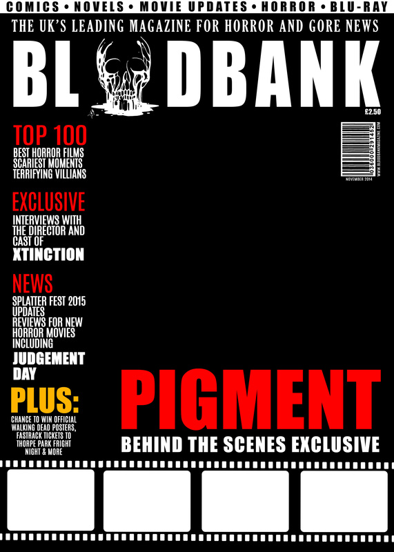
The main thing that we like about the horror magazine is the masthead as it is the most prominent piece of typography on the front cover. We particularly like the font of the masthead as it looks like a typical horror magazine font as it has graphics of blood dripping down it. The good thing about this is that it allows readers to familiarize with it and acknowledge that it is a horror magazine. Although, we have taken a liking to the layout of the magazine, we feel that there are too many images as it takes the focus away from the main image. We feel that the 4 pictures on the left would have been sufficient and the fact it becomes clustered when the 2 pictures on the right are added into the equation. We particularly like how there is consistency in the magazine as the strapline “BLOOD, GUTS, GORE & MORE” is kept the same in every scream magazine. We would like to mimic this feature as it makes the magazine look professional and stylised.
|

We like how there is a consistent colour scheme throughout the front cover. We particularly like how the colours have been chosen to match those of the main image. We feel that this will be a suitable skill to have when creating our own magazine front cover as it makes the overall product look professional and it makes it more appealing to the eye. We also like the effect that the other images on the front cover have as it looks as if it is film reel. We feel that this is suitable considering that the subject of the magazine is a movie, so it makes it more original and creative. We are going to try to incorporate this design of film reels into our own horror magazine front cover. We also like how there is a use of red colour to highlight the images and it also looks like patches of blood, which further intrigues the audience. However, we feel that the masthead is too simple considering the genre of the magazine.
|

We particularly like the main image of the magazine as the editing is very advanced and it has all the physical attributes of a zombie. The main image does the job of attracting the audience as it stands out and it is very intriguing. We also like how the background of the magazine front cover is an army of zombies, which further enforces the genre of the main image. We like how the opacity of the background is very low, so the zombies are barely visible. We feel that this gives it an air of mystery. We also like the 3D effect of the masthead as it gives it layers and makes it more eye-catching. We particularly like how there is a paw print on the side of the magazine to illustrate the "HORRORHOUND" aspect of the magazine.
|

The main thing that we found appealing about this magazine was the fact that there is a cartoon effect given to the magazine. We feel that this has been done due to the fact that the subgenre of the movie "SCREAM" is comedy horror. The use of this effect gives the magazine a playful feeling, which is similar to the movie. We also like how the main props of the movie are featured on the magazine. For example, the mask and the knife, this gives the "SCREAM" audience a sense of familiarity as these are important icons of the movie. We also like the fact that there is consistency between every HORRORHOUND magazine as the main elements such as the masthead and the tagline are kept the same, which gives readers familiarity.
|

The main thing that we liked about this horror magazine is the combination of horror icons as the main image. This can attract various audiences as these horror villains can cater to people who prefer many types of horror sub-genres. We also like how there are overlays of blood splattered all over the horror magazine which enforces the horror genres. This is also effective as it adds layers to the magazine front cover and makes it really eye-catching and attracts the target audience. We also like how there are giveaways featured on the magazine which will further attract the audience to purchase the magazine. We particularly like how there is an age rating symbol of "18" featured on the front cover to suggest that the main feature of this issue will be horror movies.
|

We like how there are various images used on the magazine in order to give it dimensions and make it aesthetically pleasing to the eye. We like how the main image has its own area and how the background is blue for that specific image which signifies that it is the main image of the magazine and it is the image that requires the most attention. We also like the fact that there are various overlays featured on the magazine. For example, the blood overlay which was placed on top of the masthead to signify the genre of the magazine. We like how the masthead is central to the magazine as it is the largest and most prominent text on the magazine. We also like the font of the masthead as it is font that you would typically associate with this particular genre.
|
|
|
Initial Drawn Drafts |
|
These are our initial drawn drafts in black and white to show roughly what we want our magazines to look like. We have included a sketch of our main images with added conventions of magazines. We concluded from our audience research that our magazine masthead will be called Blood Bank. We are happy with this title as this was also our favorite. Currently the chosen font for our magazine is undecided. Our drawn drafts are our chance to show a little experimentation. We also wanted the main character on out magazine to be our antagonist rather than our protagonist because this is more common in horror magazine and would connote horror better than using and image of a victim as the antagonist is more frightening.
|
|
HAND DRAWN MAGAZINES |
|

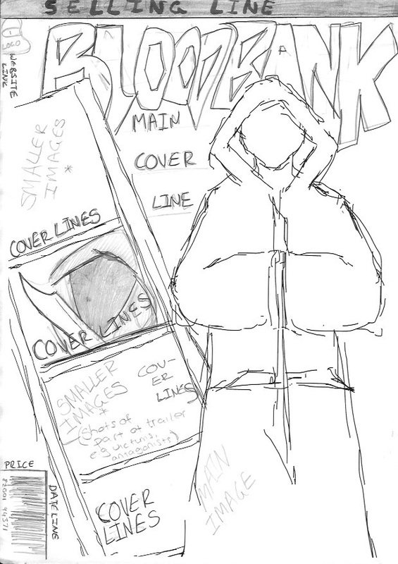
The main image for this magazine is a close up shot of our male antagonist cloaked in a hooded robe. You can see he is wearing a symbolic necklace, The main cover line sits on the left of the main image at the bottom of the page. All the smaller cover lines are place on the right of the page. We have included the price on this draft above the bar code. We have decided that our price would be £2.50. This is the price the majority of our audience agreed they would buy our magazine for. The selling line does not run along the top of the page but instead is boxed on the right. The masthead is big and bold and is called 'BloodBank' There is also a 'Plus' category that can be found on many magazines.
|

The main focal point of this magazine is the the knife in the main image. It is being held tightly by the antagonist. The cover lines curve around the knife which frames it and draws the audience attention to this prop. We particularly like how the main coverline is framed around the shape of the knife to make it more in sync and allows the elements of the magazine cover coincide and flows together. The main image takes up the majority of the page. The masthead is placed in the left corner below the selling line. The website link e.g. www.paranoiapictures.com, is placed on the top right hand side of the front cover. The barcode is placed at the far right of the page, so as to not take up too much space.
|
Firstly, the main image for this magazine draft denotes a tall man hooded in a long robe that covers his interlocked hands . Above him is where the masthead would be placed. The selling line runs along the top of the page and the logo sits just under that on the left. We are thinking of adding our groups logo to the magazine as most magazines usually add their company's website link too. The cover lines would be put into four boxes in a column that slants diagonally to the left. This is typical of many horror magazines to have other images placed around the main image. The bar code would be placed at the bottom left of the page-this is where magazines usually place their bar codes.
|

The main image shows the victim/protagonist's face above the antagonist's face. This is different from the other drawn drafts as they do not include the protagonist. The NVC of the victims face connotes fear as it appears she is in distress. Her mouth is open as if she is screaming and her eyes are tightly closed. The antagonists face would be composed in comparison and this would connote that he has a certain power and would result in him looking frightening. We particularly like this drawn draft as it would give the magazine dimensions and makes it more appealing to the audience. Similarly to the rest of the drafts, the barcode has been placed in a small area, so it doesn't attract too much attention.
|
|
|
Poster Drafts: |
|
These are rough outlines of what we want our poster to look like. They included the main image tagline, trailer title and credits and release dates. We have place them where we want them to be. WE have also shown an idea for our chosen font and are pleased with how this looks.

The right side of out antagonists face is cut out on this draft. This is seen quite frequently on horror posters. The title is placed at the top and below that is the tagline. We like how the antagonists eye is blank, we could use this as an idea and get our subject to wear contact lenses as part of their costume. We particularly like how this is an extreme close up of the subject's face which would attract the audience, as it is rather aesthetically pleasing to the eye. This also allows us to manipulate the subject's image to the extent that we please as there would be no other distracting feature on the magazine. For example, we can edit it how we like or we can use makeup to make the subject as gruesome as possible.
|

A wide shot like the one used on the Friday 13th poster shows three men dressed in religious looking robes.The faces of the antagonists are barely visible which creates mystery and makes them look suspicious. It creates a sense of caution which may intrigue the audience. It also enforces the fear of the unknown was is typical of other horror magazines as this would intrigue the audience enough to research more into the movie. We also like how the prop is used in the poster to create an icon for the movie which would also help in the marketing process. The tagline is placed at the bottom of the poster which is used often in real horror posters.
|

The NVC used for this poster was our favourite. We thought about adding blood to the hand as if he is tasting it which would reflect more about our trailer. We also like how the main image is a close up meaning that the main attention will be on the image. This means that we can manipulate the image to any extent that we feel. We also like the fact the main image and tagline are both placed above the main image, which is rather conventional for horror movie posters. We like the fact that the cult's symbol is placed on the hand of the antagonist; which further emphasizes the cult aspect of the movie.
|

This draft was specifically inspired by the poster for "The Texas Chainsaw Massacre." We used the idea of having a slightly low angle of our antagonist and using lighting to fade out the left side of his face so that only one eye is visible. We feel that intimating the use of lighting on the Texas chainsaw massacre will be a good thing to do as it would make the poster have an ominous atmosphere and enforce the genre of the movie. We will also be keeping the costume of the antagonist the same to have a sense of continuity between the poster and the magazine and also give the audience something to familiarize with.
|

We liked the placement of the text on this draft because we want out tagline underneath our title and our credits and release dates separate to evenly space out the text. We thought that doing this will allow us to challenge typical conventions in order to separate us from the norm. Similarly to the other poster drafts, we incorporated the cult's symbol into a necklace in order to make the poster more appealing to the eye. Through this it will attract the audience's eyes and intrigue them about the movie and cause them to research into the movie. It would also become a known icon of the movie, which would appeal to the audience.
|
|
|
Hand Drawn COMPLEx- Magazines
|
|

On these drafts we have begun to apply colour and experimented with more masthead styles. We particularly like how the cover lines frame the knife. The focal point of this front cover is the prop in the antagonists hand. We have used the opportunity of colour to enforce the idea of blood onto the antagonist's knife. This will also signify that this is a horror magazine as blood is largely associated with the genre of horror. We have also shown where we would like the shadows to fall- mostly around the hooded face and the edge of the knife.
|

This shows a close up of the antagonists face. We have used Photoshop to place shadows in all the places that we feel that it would be best to be. For example, the shadow under the antagonist's eyes. The cover lines unlike the first draft are placed on the right hand side and are placed in square boxes. We preferred the fist one because of the angles of the shapes were different and not boring. The sharp edges reflect the idea of killing because it portrays the edge of a knife.
|

The price is placed next to the selling line unlike the other drafts. We have also added a close up of our protagonists face which sits behind the antagonists face. We can see more clearly now the emotion of the victims face which expresses pain and fear. We particularly like how the cover lines are framed around the shape of the main image. We feel that this gives the magazine a modern and professional look, and also makes it resemble that of a real media horror magazine.
|

This draft focuses more on the use of the colour black and white which really exaggerates the costume shown in the long shot of the antagonist. This has been done so that the audience's attention is drawn to the main image. The fact that his face is not visible gives the magazine an air of mystery which will intrigue the audience into reading more about the movie. The column on the left side will also enable us to include more images and still look structured and gives it a professional feel.
|
|
|
Hand Drawn Complex - Posters |
|
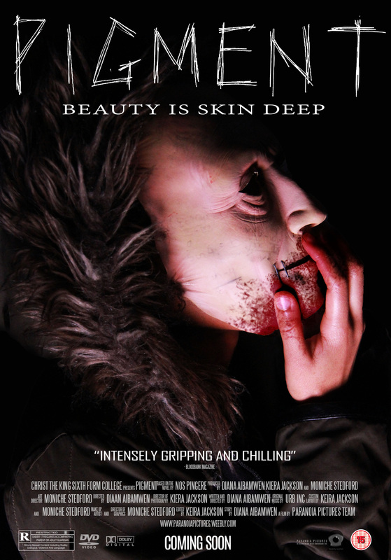
All of these complex digital drafts are in low key lighting as this is extremely common with horror magazine posters. This is effective as low key lighting is eerie and connotes mystery and the fear of the unknown. We decided after completing our audience research that our colour scheme would be Red, Black and white. White being the least dominant colour but used effectively would help in making the text stand out amongst the dark colouring. The colour black connotes death and darkness. The black background represents evil lurking around the main image and also enhances the red and the white text making the colours appear even more deadly.
Our tagline "Beauty Is Skin Deep" is placed on every draft along with our trailer title "Pigment." The font of this text is the same on every draft.
Our tagline "Beauty Is Skin Deep" is placed on every draft along with our trailer title "Pigment." The font of this text is the same on every draft.

This draft shows a Mid/close shot of our antagonist dressed in a red robe. The hood covers his eyes. This creates intensity as the audience cannot see where he is looking but can imagine that he is looking at them (at the camera.) This further emphasizes the genre of the movie as creating tension for the audience as a large aspect of horror movies. It also makes the character look mysterious and also reinforces fear of the unknown.
|

In this draft the side of the antagonists face fills up the majority of the page. Only half of his face is visible. His NVC connotes power as his facial expression is calm, which suggests a sense of arrogance. His eyes have been blacked out which also helps make him look frightening. We also thought that maybe in the real poster we could add a lift in the corner of his mouth to make him appear evil and merciless.
|

We really liked this draft because of the lighting and how the positioning of the lighting creates a shadow on the characters neck and forehead. This use of lighting will help give the poster a mysterious and ominous effect. There is also blood smeared on the characters face where it looks like he is tasting the blood on his fingers. This emphasizes the basis of the synopsis. The symbol on his hand is also visible. The structure of this draft in simple yet effective in communication a sense of evil and horror.
|

This draft uses a lot of fading effect to make it look scary and mysterious as it will intrigue the audience about what the movie is about. The left side of the characters face is smudged and barely visible so it even looks like his mouth is stretched but not entirely visible. The fact that important features of the antagonist's face is hidden takes away the identity from the subject, which also enforces fear of the unknown. This is a very important aspect of horror movies and will give the audience a sense of familiarity.
|

In this poster, there are three figures standing in unison in similar outfits. This will suggest to the audience the idea of cult movements and intrigue them about the narrative of the movie. The main prop of the movie is featured in the poster and it has patches of blood on it to highlight the basis of the movie. It also works in sync with the other red elements on the movie poster, which grabs the audience's attention. The title of the film is kept as the most prominent and eye-catching typography on the horror movie poster.
|
|
|
DIGITAL DRAFTS
|
|
These are our first photo drafts experimental photos to represent our antagonist. We experimented with lighting, camera angles and poses. Throughout the selection, some of the images vary between the main images for the poster and magazines. We did this so we could really see what our front cover main image would look like. This mask is quite close to the appearance in our drafts.
|
|
pOSTER DRAFT 1 |
|

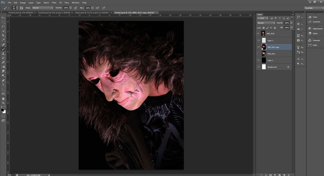
The first step involved the editing of the original image. I used the quick selection tool to highlight and delete some of the lighter areas of the background. A dark gradient colour was added behind the image as a replacement background.
I then adjusted the darkness and contrast of the image to contribute to the 'sinister' mood denoted by the main antagonist.
|

Using the quick selection tool, I select the face and fingers. Within the selection, I used a certain brush to mimic the appearance of blood. The layer style was changed to 'Multiply' which would allow the shades, colour and flesh lines to become visible through the blood, hence adding a sense of realism.
|

Grid lines and the ruler option were used to allow further accuracy towards the outcome of the digital draft. Due to the audience research feedback being not completely finalised, I decided to use the same font used for the titles of my hand drawn drafts.
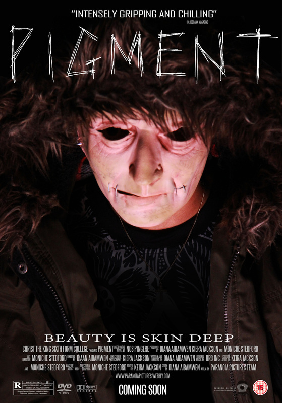
I also selected common symbols and logos featured to a diverse amount of movie magazines such as the 'R-Rated', 'DVD Video' and 'Dolby Digital'
|
Using the ideas from our previous drafts and our photo drafts we have taken our drafting further by combining them. This poster draft was our favorite. You can see we have added blood to one of our draft photos- this is an idea we came up with during the early stages of our drafting. We are pleased with this result. The dark blood breaks up the bright lighting on the antagonists face and also makes it look more horrific. In our final product we might make it look as if he is tasting the blood. We have also included the age rating on this poster- although it is undecided it will either be a 15 or an 18 but for visual purposes we have included it for now.
|
|
pOSTER DRAFT 2 |
|

The first step involved the editing of the original image. I used the quick selection tool to highlight and delete some of the lighter areas of the background. A dark gradient colour was added behind the image as a replacement background.
I then adjusted the darkness and contrast of the image to contribute to the 'sinister' mood denoted by the main antagonist.
|

The brightness of the models shirt interfered with the visibility of the typography, therefore, I used the quick selection tool to select the area and add a gradient shade.
|

Grid lines and the ruler option were used to allow further accuracy towards the outcome of the digital draft. Due to the audience research feedback being not completely finalised, I decided to use the same font used for the titles of my hand drawn drafts.
|
We like how the antagonist looks like he is staring at the camera (target audience) this increases the scare factor and the intensity of the film being advertised. It also creates tension for the audience as it can be intimidating to look at an image that is staring directly at you. The main image also appears as if he is smiling, which can cause an unsettling atmosphere for the audience, further enforcing the genre of the movie.
|
|
POSTER DRAFT 3 |
|
The first step involved the editing of the original image. I used the quick selection tool to highlight and delete some of the lighter areas of the background. A dark gradient colour was added behind the image as a replacement background.
I then adjusted the darkness and contrast of the image to contribute to the 'sinister' mood denoted by the main antagonist.
The brightness of the models shirt interfered with the visibility of the typography, therefore, I used the quick selection tool to select the area and add a gradient shade.
|

Grid lines and the ruler option were used to allow further accuracy towards the outcome of the digital draft. Due to the audience research feedback being not completely finalised, I decided to use the same font used for the titles of my hand drawn drafts. The credits became easier to produce after the first draft - especially due to the duplicating method.
|
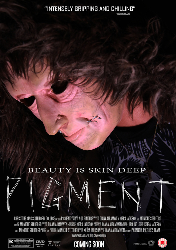
We were pleased with the overall look of this poster draft. We like how the lighting is placed at a low angle because his face is brightly lit up and his eyes look dark and hollow in comparison. This draft gives us a deeper insight into the making of our poster and what the final product will look like. With different make up and costume we feel our poster will be successful. When creating our final product, we will manipulate the main image in order to give it dimensions and make it more aesthetically appealing to the audience's eyes.
|
|
Magazine Digital Draft 1 |
|

The first step we took when creating this digital draft is we had to adjust the contrast and brightness. This would help increase the ominous effect of the magazine as it would look spooky and mysterious.
|

We then had to place the guidelines onto the document in order to keep the magazine structured and aligned. We then placed the magazine's masthead at the top of the document, which is typical to real media magazines.
|

The last thing that we had to do was to place the remaining elements onto the document. For example, the magazine's website, the coverline and the selling lines. This was done by placing boxes in the place of each element.
|

We have included the decided price of our magazine on the bottom right corner of this magazine front cover. The magazine draft below also includes this in the same place. We quite like how the text frames the main image as there is a sense of structure and makes it look professional. We feel that the use of dark colours would be effective in attracting the older audience which is essentially what we are aiming for. We do not want our magazine to appear childish in anyway in order to make it as horror based as possible.
|
|
Magazine Digital Draft 2 |
|

The first thing that we had to do was to import the image that we were going to be working with onto Photoshop.
|

We then had to place to guidelines onto the document before placing all the elements onto the document.
|

The last thing that we needed to do was to place the masthead onto the file using the guidelines in order to give it structure.
|

We preferred this magazine draft to the one above because the font of the main coverline and the masthead is more similar and therefore gives more of a sense of continuity. In comparison the magazine cover above the coverlines are placed on the right hand side of the page. We feel this creates dead space on the left side.
|
|
PHOTO SHOOT 1 |
|
Here is our first photoshoot where we applied costume and make up. These photos will be used to create our final drafts.
For some of these photos we thought it might be appropriate to brighten them on Photoshop when editing and completing our final drafts. Eventually we will have 10 final poster drafts and 10 final magazine drafts.
To create a shadow across the antagonists face a light was held at a low angle. We used Iso 200 and set our flash on. We also manually focused before taking all shots.
To create a shadow across the antagonists face a light was held at a low angle. We used Iso 200 and set our flash on. We also manually focused before taking all shots.
|
|
COLOUR SCHEME
|
|
Movie posters often have a certain colour scheme throughout which corresponds in parallel with the films genre. We want to use a colour scheme which will obviously connote horror but it is also important that our poster is strong in originality and creativity. Due to the feedback gathered in the audience research, we decided to go ahead with the colour scheme of red, black and white. We thought this scheme not only suits the one given to our antagonist, but also the overall movie synopsis as the colours connote death, blood, violence, and then the purity of the protagonist.

|
|
TYPOGRAPHY
|
|
POSTER
|
Although certain feedback based around the typography of our products requested the fonts 'INSOMNIA', we all agreed that the options given lacked diversity, as they all appear to be quite similar. As a result, we decided to use a thinner font as we want our product to draw attention to the antagonist.
|

This will not be used in the final poster product
|
REVIEW: AGENCY FB

CREDITS: STEELTONGS FONT

This font has been used on both products. For the poster it has been used mainly for the credits and cast names, however it has also been used for the 'Bloodbank Magazine' name underneath the review
|
|
experiments: magazine layout |
|

|

|


|


|

|

|

|
|
|
experiments: poster layout |
|

|

|

|

|

|

|

|

|

|

|
